Building Hope
Campaign
Helping The Joe Nuxhall Foundation fundraise $7 million.
For people who value inclusion, especially in sports, The Nuxhall Foundation is the non-profit providing individuals with disabilities every opportunity for play, therapy, and athletics.
Only The Nuxhall Foundation celebrates and gives every individual, every chance. Because in a world that wasn’t built for them, the Nuxhall Foundation was.
The background.
The Joe Nuxhall Foundation—located in Fairfield, Ohio—is a beacon of hope for those of all ages with any type of disability. Currently, the Foundation’s campus holds two baseball fields, a mini golf course, and playgrounds. All are accessible to any who wish to play on them. However, this wonderful organization dreams of making an even bigger impact. Thus, the idea for a HOPE Center, a year-round accessible indoor facility, was born. My team was tasked with creating multiple tactics to help The Joe Nuxhall Foundation reach their capital campaign goal of $7 million.


Images courtesy of The Joe Nuxhall Foundation.


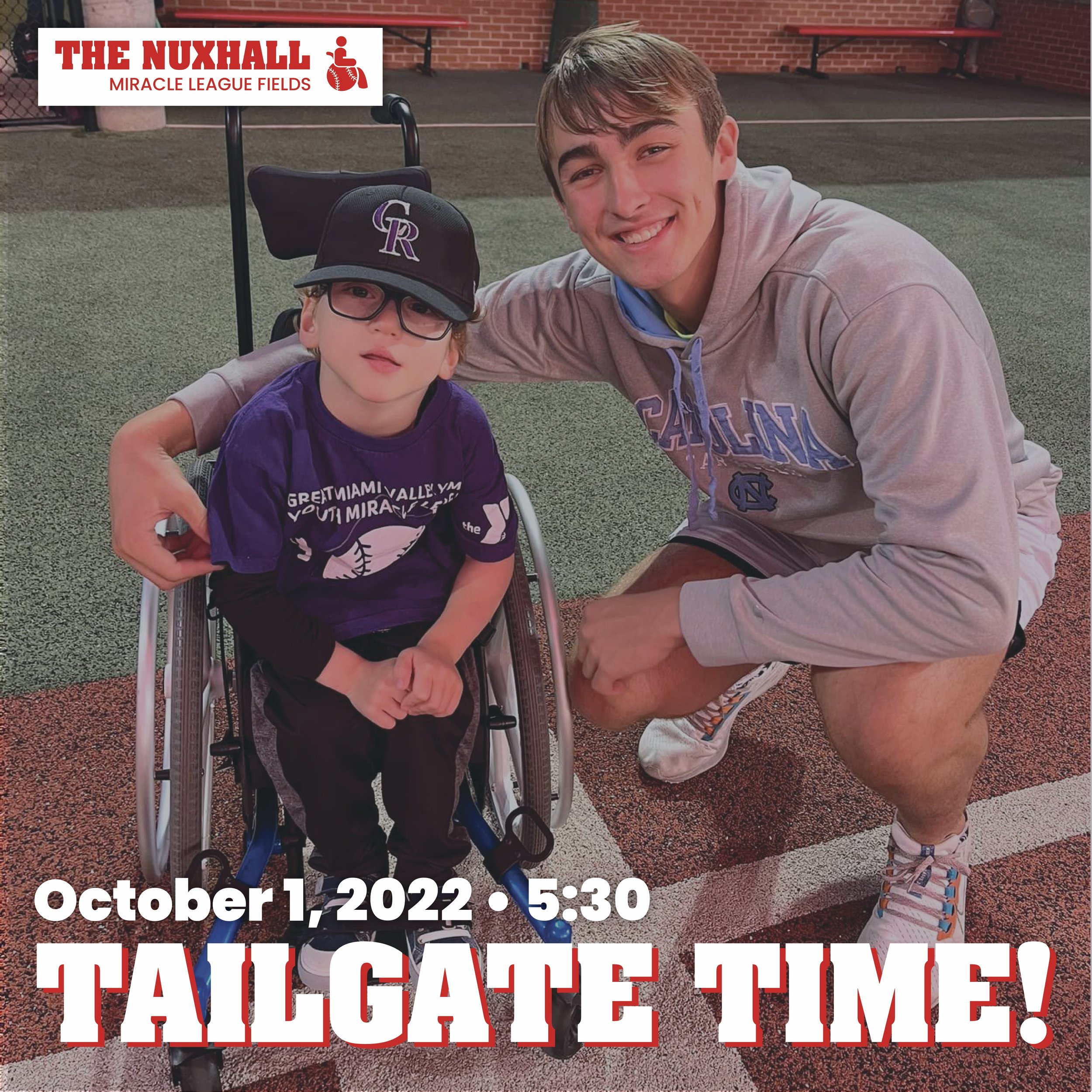
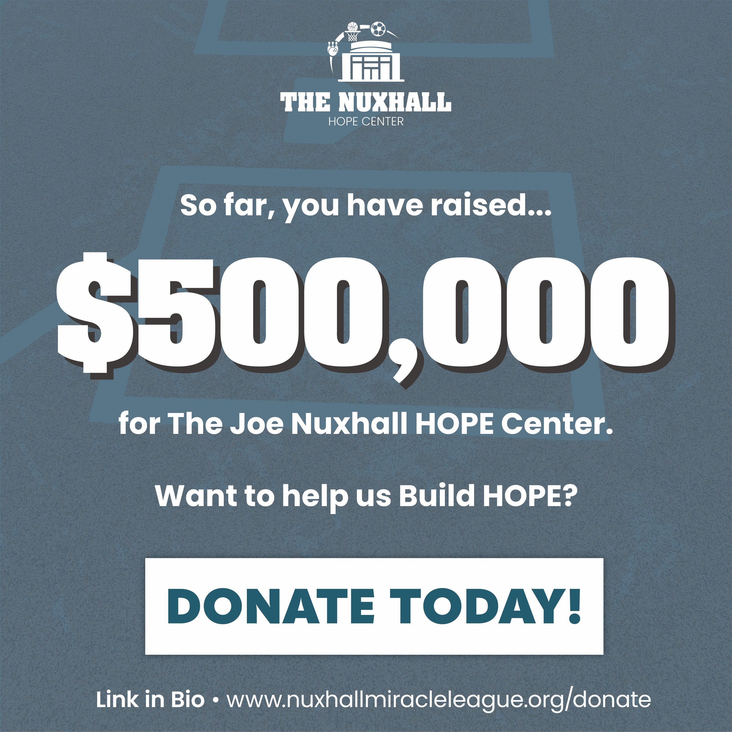
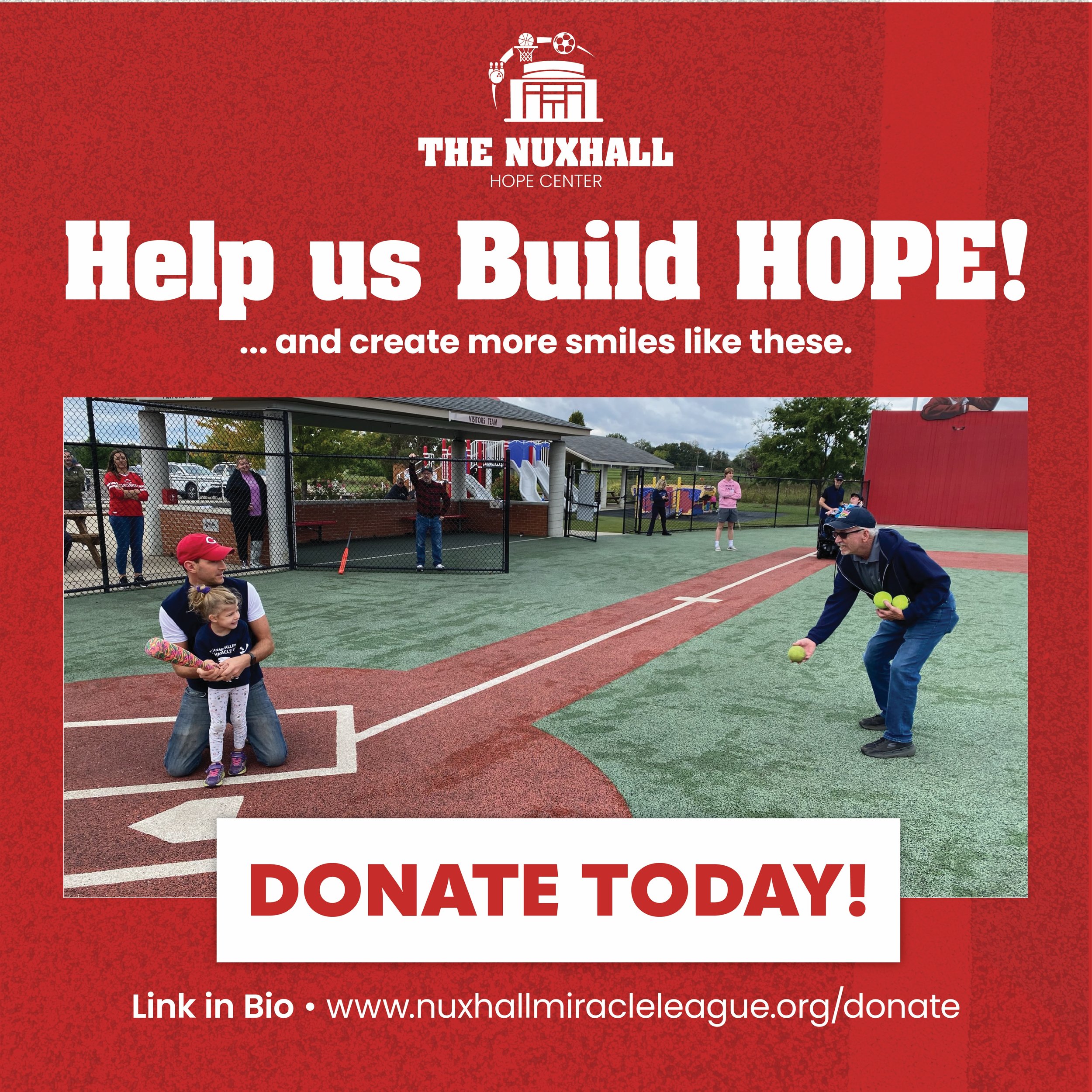
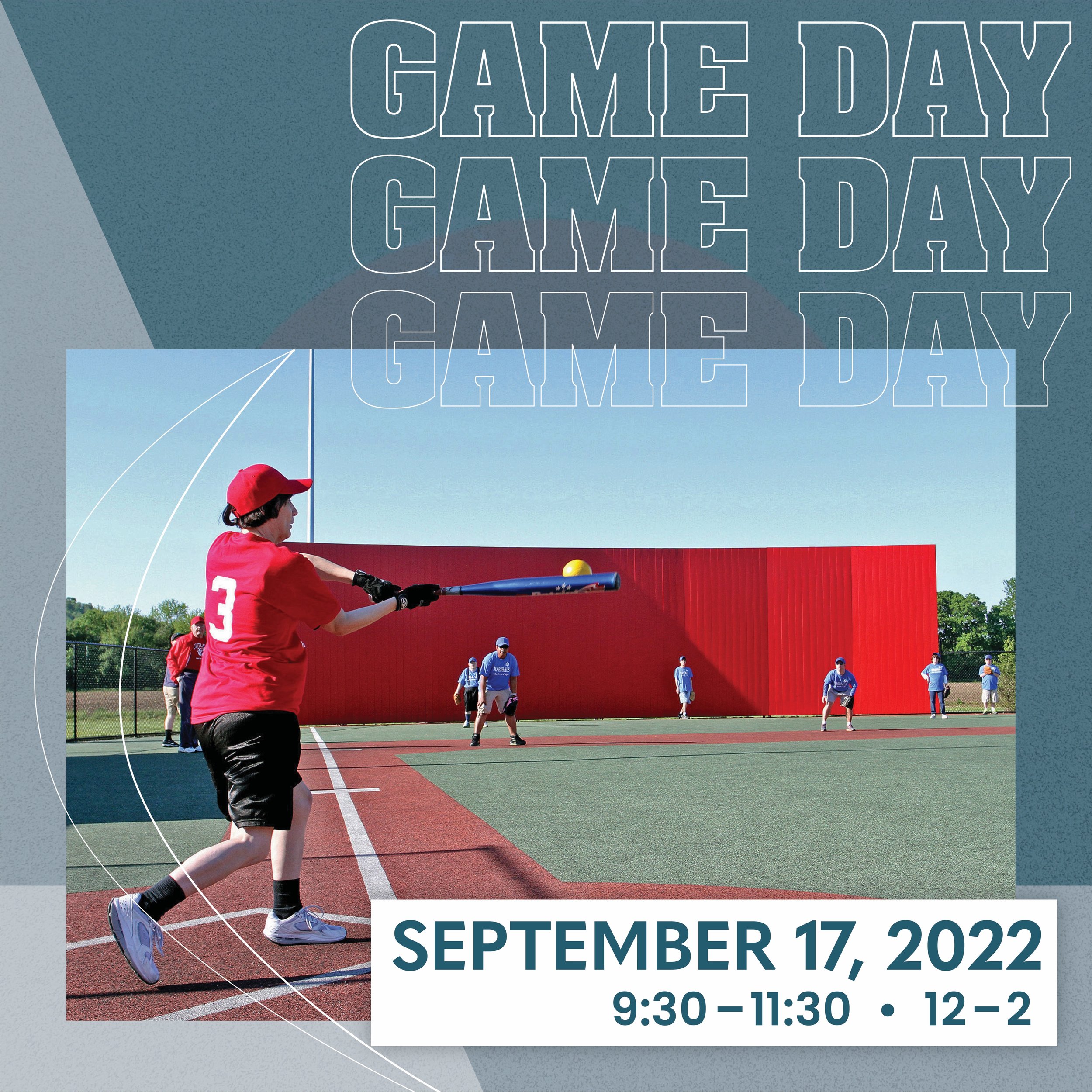

Our team proposed a visual rebrand due to the current Foundation and its subsidiaries having widely varying logos. To create a recognizable and consistent brand, designers created a simple example of a consistent, yet flexible logo redesign for Nuxhall’s various brands and signature events. A new color palette and fonts were established, in order to emphasize a cohesive brand image in future collateral. The final brand marks for each signature brand, as determined by the Foundation, can be seen above.
Multiple mockups were designed to present to the Nuxhall Foundation board, including physical materials and revamped social media graphics.
How to Build HOPE: I.
How to Build HOPE: II.
The current donation processes of The Joe Nuxhall Foundation needed to be streamlined to encourage higher spending, raise awareness of the campaign, and reach multiple identified donor groups. Our team redesigned the donation landing page and pop-up on the foundation’s current website, as well as a physical direct mailer. Both designs aim to directly alert individual donors, both those who are and aren’t aware of the foundation, to the new capital campaign. The direct mailer, meant for the foundation’s current supporters, is also meant to add a personal touch to the fundraising process.
The entire strategizing and design process took place over the course of three months. Through identifying multiple donor groups in various areas, creating personas, carefully selecting design channels and tactics, and finalizing high-fidelity visuals, our team was able to deliver a plethora of material. The entire process, along with additional strategies and designs, can be found in the 50-page brand and process guide which I designed and assembled. Please feel free to contact me with any questions about the campaign tactics or design!
How to Build HOPE: III.
Materials designed in partnership with Tuuli Pirinen. Marketing tactics developed alongside Kyle Armando, Elizabeth Lowengart, Alexa Hoover, and Cynthia Liscek.
