Museum of the Moving
Image Rebrand
A new brand image that communicates the mission and purpose of a unique New York City museum.
View full brand book here.


The background.
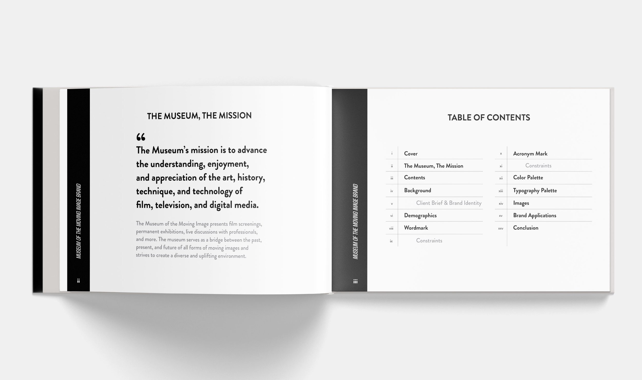
The goal of this rebrand was to bring more life to the the Museum of the Moving Image’s (MOMI) current branding and branded materials. MOMI’s mission is to advance the understanding and appreciation of all moving media, including film, digital media, television, and more. Through multiple exhibitions, film screenings, talks with industry professionals, and a collection of more than 130,000 objects, the museum fulfills this mission within their vibrant and uniquely constructed space in Queens, NYC.
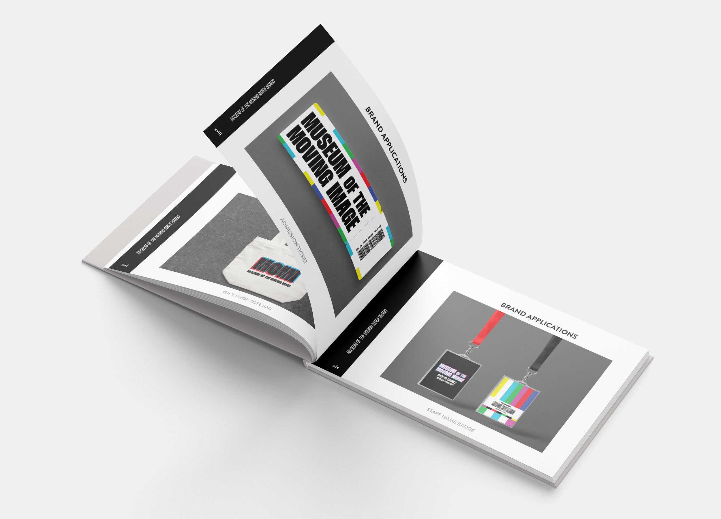
Ultimately, a flexible brand was created to represent the multitude of activities and exhibits the museum offers while also communicating their purpose and mission.
Images courtesy of Museum of the Moving Image and ArchDaily.
A museum in motion.
Motion is a large part of the museum’s brand. It obviously embodies the purpose of the museum. However, it also has an amazing ability to catch the eye, especially among static traditional marketing techniques. New York City is a bustling town and static images can often get lost among the millions of other advertisements. In order to elevate the brand and convey the museum’s purpose, multiple motion graphics were created for implementation across any digital or video marketing.
Color and type.
The museum commemorates both past, present, and future of the moving image. Thus, multiple elements were incorporated to convey this timeless image. Grain and “fuzzy” textures are motifs placed throughout branded materials, along with black and white, calling back to the early beginnings of television and film. However, the colors of the SMPTE color bars and RGB overlays are prolifically used, signifying the constant innovation of the present and future of moving images.


